


Ranking Every Current CEBL Jersey: Part II


In a league with just ten teams, the Canadian Elite Basketball League possess some incredible jerseys. As someone who takes an interest in sports jerseys, and owns too many to count, I thought I would give my take on every current jersey in the CEBL and rank them 35 to one.
The following list is my personal opinion and by no means do I claim I am more right than anyone else. If you disagree with any of my rankings, please let me know in the comment section below!
23. Edmonton Stingers Navy
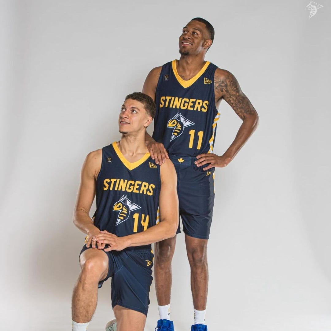
The Edmonton Stingers have one of my favourite logos in the league. The Navy with yellow trim is an excellent look for Northern Alberta’s team. I guess you could say it’s a little generic like a few other team’s jerseys but the logo is so great, it cracks my top 25. I’ve always been a fan of uniforms with yellow as the secondary colour to compliment a dark colour like the Oakland A’s, Michigan Wolverines or Pittsburgh Pirates/Steelers/Penguins.
22. Scarborough Shooting Stars Black Alternate

If anyone wants to tell me they don’t like Scarborough’s jerseys, nize it fam.
That’s as much Toronto slang as I’ll try. I make myself cringe even when typing it. The Shooting Stars go all black with a wordmark that reads ‘The ENDSSS.” The term “Ends’ is often used to describe Scarborough because it is the East end of Toronto. It’s a term that represents their community. I’m sure there’s much more to it that a guy from Alberta can’t understand but I like it regardless. The clever addition of the SSS team initials makes it kind of like an NBA “City” jersey. The all-black with white outlines is clean and pleasant to look at, styll.
21. Montreal Alliance “MTL”

I can’t tell if this jersey is navy or black but based on the Alliance’s social media that uses the theme of an ‘MTL Blackout,’ I guess I’ll assume it’s black (even though the player’s black undershorts look darker than the jersey). I like the colour combination with the red trim, teal ‘MTL’ and white number. One neat thing about Montreal’s uniforms is that instead of a maple leaf emblem on the shorts’ waistband, the Alliance have a fleur-de-lis. Quebecois pride spreads all the way to the CEBL.
20. Winnipeg Sea Bears Black

The Sea Bears logo is another fantastic one in the CEBL and pays homage to the World Basketball League’s Winnipeg Thunder logo. I love the teal, black and white and that’s why I have them at this spot but the lack of creativity in the jersey itself is why it’s not top 10. For a team that makes bold roster moves, you’d think they would be just as bold with what they’re wearing.
19. Winnipeg Sea Bears White

I give the white the slight edge just because I tend to favour white jerseys over black if they are pretty much the same. The Sea Bears brand has so much potential with Winnipeg’s great basketball history, community, logo and colours. For what it’s worth, these current Sea Bears uniforms get the job done but I hope they can give us something just a little better when they host the 2025 Championship Weekend.
18. Brampton Honey Badgers Yellow

It’s really hard to go wrong with yellow and black. I do wish the Honey Badgers logo was a little bigger and the vertical stripes were actual pinstripes but it’s still a great jersey. And I love the claw scratch on the shorts. As much as I like this jersey and the black one, the colours deserve to be in Hamilton. Maybe they’ll move back someday or Brampton will rebrand to a new name that they can firmly call their own.
17. Montreal Alliance Teal

I’m sorry, Winnipeg but for now, this is the best teal jersey in the league. The Alliance’s logo is a little busy and gets a little lost on these teal jerseys but the very faint vertical stripes (might be real pinstripes) look so good. I also love the red collar and the Alliance-branded fleur-de-lis on the sides.
16. Scarborough Shooting Stars Primary White

I’m not sure what the design aspects are for this jersey or the story behind it but I really like the arch that wraps around to the sides with the city wordmark and whatever the border around the black is. The Shooting Stars don’t do a great job with storytelling other than reminding us how ‘cool’ they are. Unfortunately, you can’t buy this jersey on the Scarborough site, so they get minus points for that.
15. Vancouver Bandits White

The Bandits added their logo to this jersey, which looks way better than last season. As much as I am not a fan of the team, they have the best collection of uniforms. I know some love the logo and some say it reminds them of Swiper from Dora the Explorer but it’s still a neat logo. The winding thin lines do a great job of framing the uniform as a whole.
14. Ottawa Blackjacks White
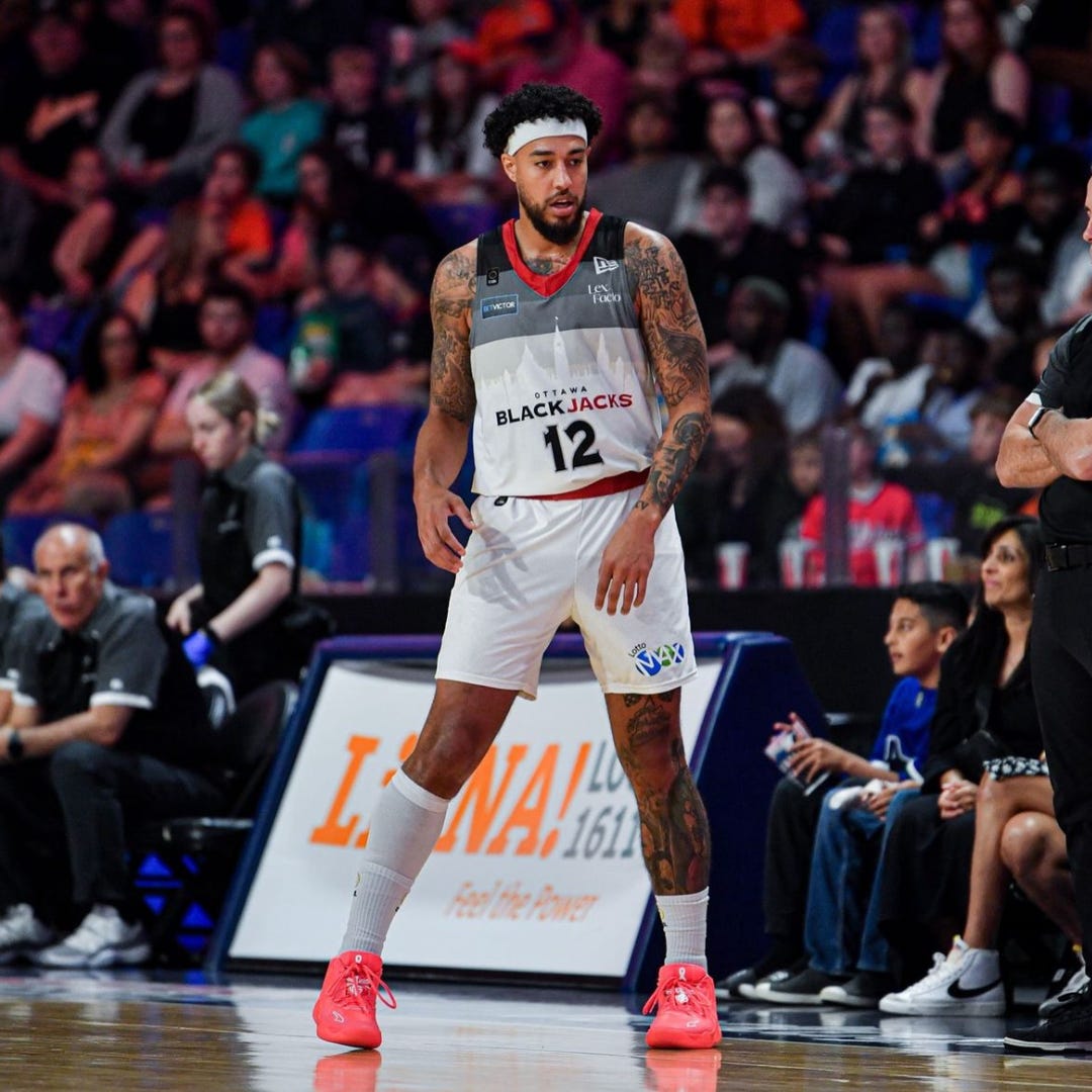
Why would Ottawa ever wear their generic CEBL template whites when they have these beauties? The Blackjacks scrapped last season’s jerseys that featured their primary “Jackrabbit” logo for this multi-shaded uniform. The gradual shading stripes remind me of those Utah Jazz jerseys from a few years ago. A faint outline of Ottawa’s cityscape, including Parliament Hill gives an identifying component to team in the uniform.
13. Edmonton Stingers Yellow

The primary yellow jerseys for Edmonton are certainly their best. While they are just a colour swap of the navy ones, the yellow is so eye-catching under the well-lit Edmonton Expo Centre and contrast well if their opponents are wearing a dark jersey. One of my favourite parts of this jersey is the Stingers’ secondary logo on the shorts. This logo is just the head of the bee and adds even more to an already great uniform.
12. Calgary Surge 88’s Throwbacks

I’m a sucker for nostalgia, but who isn’t?
The Calgary Surge turned back the clock to 1992 with these throwback uniforms of the WBL’s Calgary 88s. The Surge swapped their normal whites for these in the second half of their home opener at the Saddledome. It was a great moment of wardrobe theatrics and I loved everything about it.
The jersey itself is a clean white jersey with that vintage-looking 88s logo. I also tip my cap to the Surge organization for going through a long process to be allowed to wear these. I hope we see more throwback jerseys in this league! And if Halifax ever gets a team, they’ve got to bring back the “Windjammers.”
11. Scarborough Shooting Stars White Alternate

This is just an inverted version of the black ENDSSS jersey but I love this one so much more. It’s clean and minimal but striking to the eye. Scarborough is known as the ‘cool’ team in the CEBL for their ties to Drake and this jersey is cold as ice.
Stay tuned for the third and final of my ranking of every current CEBL jersey and please subscribe to the SurgeStack! You can subscribe for free, but if you feel inclined to contribute a few bucks, I would really appreciate it! Any contributions allow me to put more work into this blog.
Love love love this series of articles! (and I beat Darren to reading it first this time!)
Of course this series would catch my interest since I’m a fabric girl lol. My favs were the jerseys with pinstripes. Something about that thin vertical stripe just screams classy! I do like the teal/black combos as well - could be why I also like the SJ Sharks uniforms.
Great series Ethan!!