


Ranking Every Current CEBL Jersey: Part I


In a league with just ten teams, the Canadian Elite Basketball League possess some incredible jerseys. As someone who takes an interest in sports jerseys, and owns too many to count, I thought I would give my take on every current jersey in the CEBL and rank them 35 to one.
The following list is my personal opinion and by no means do I claim I am more right than anyone else. If you disagree with any of my rankings, please let me know in the comment section below!
My posts are free to view and read but if you feel inclined to support my work, it would mean a lot if you contributed! Your contribution allows me to put more time towards this content. There is no obligation to contribute.
35. Niagara River Lions Navy

The River Lions introduced a new set of uniforms this season with all of them no longer featuring their lion logo and ‘River Lions’ wordmark. Starting in 2024, “NIAGARA” grazes the chest of players. The navy jersey is known as one of the worst in the league. To make things worse, the jersey's backside features a massive advertisement above the number. There’s not too much to like about this tarp.
34. Niagara River Lions White

The white jersey is just slightly better than the navy but still lacks any identity. Not sure what Niagara was thinking with this rebrand. The only thing that I kind of like is the chevron design along the side.
33. Saskatchewan Rattlers White
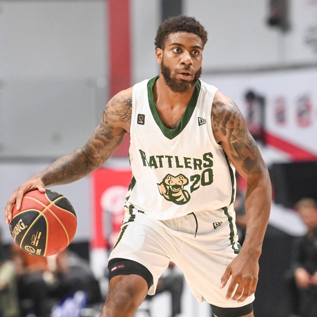
There’s nothing really wrong with this jersey but there’s also nothing special about it. The Rattlers wordmark with the logo below is pretty bland but fortunately, the team has some better jerseys in their collection.
32. Niagara River Lions Green “NRL”

While I’m not a fan of the bright green personally, I think the River Lions alternate jersey is the best one they have. The bolded and enlarged ‘NRL’ is much better than their ‘Niagara’ wordmark. A paw mark on the shorts is the only identifying piece of the mascot which I find peculiar. None of the River Lions jerseys feature their primary logo which I actually think is a decent emblem.
31. Saskatchewan Rattlers Green

Again, there’s nothing wrong with this jersey, just like the white. I favour this jersey over the white because I like the tan on the collar and the logo. One part of the Rattlers brand kit that I like is their secondary Rattler tail logo which also looks like a wheat spike. It’d be cool to see that logo on a jersey one day.
Also, can you tell I’m not a fan of green?
30. Ottawa Blackjacks CEBL Template White

When the CEBL played their inaugural season, each team was given a jersey with the same template: The team's colour on the shoulders, the city name on the chest and a scatter-shaped pattern along the abdomen and shorts. For what it’s worth, I like the template but there’s no reason to still be wearing it in 2024. Especially since the Blackjacks have a much better white jersey in their set.
29. Edmonton Stingers CEBL Template White
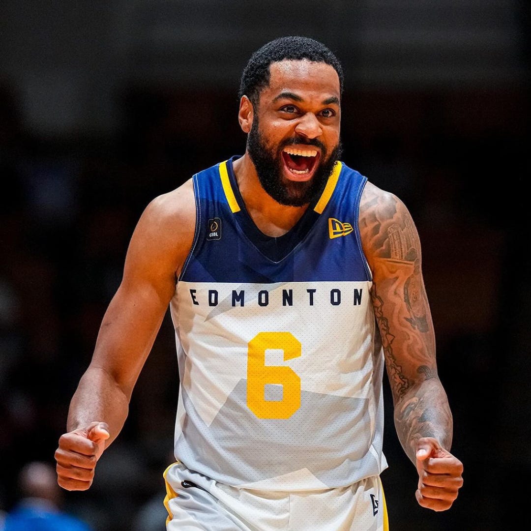
The Edmonton Stingers are the only other team to still use the original CEBL template jersey. I’ll give credit to whoever designed these jerseys, they look solid. Much better than some other leagues that used templates in their first season (*cough cough* PWHL *cough cough*). I give Edmonton the slightest edge over Ottawa because this is the only white jersey that they have.
28. Montreal Alliance Navy

Simple but effective jersey here from Montreal. Red and blue are usually the go-to colour combination for sports teams in Montreal. The other consistent brand signifier for professional teams in Canada’s second biggest city? Team names that are hard to make a mascot out of. Canadiens, Alouettes and Alliance…? That’s a discussion for another day. This navy jersey is decent but the most forgettable out of their lineup.
27. Winnipeg Sea Bears Teal
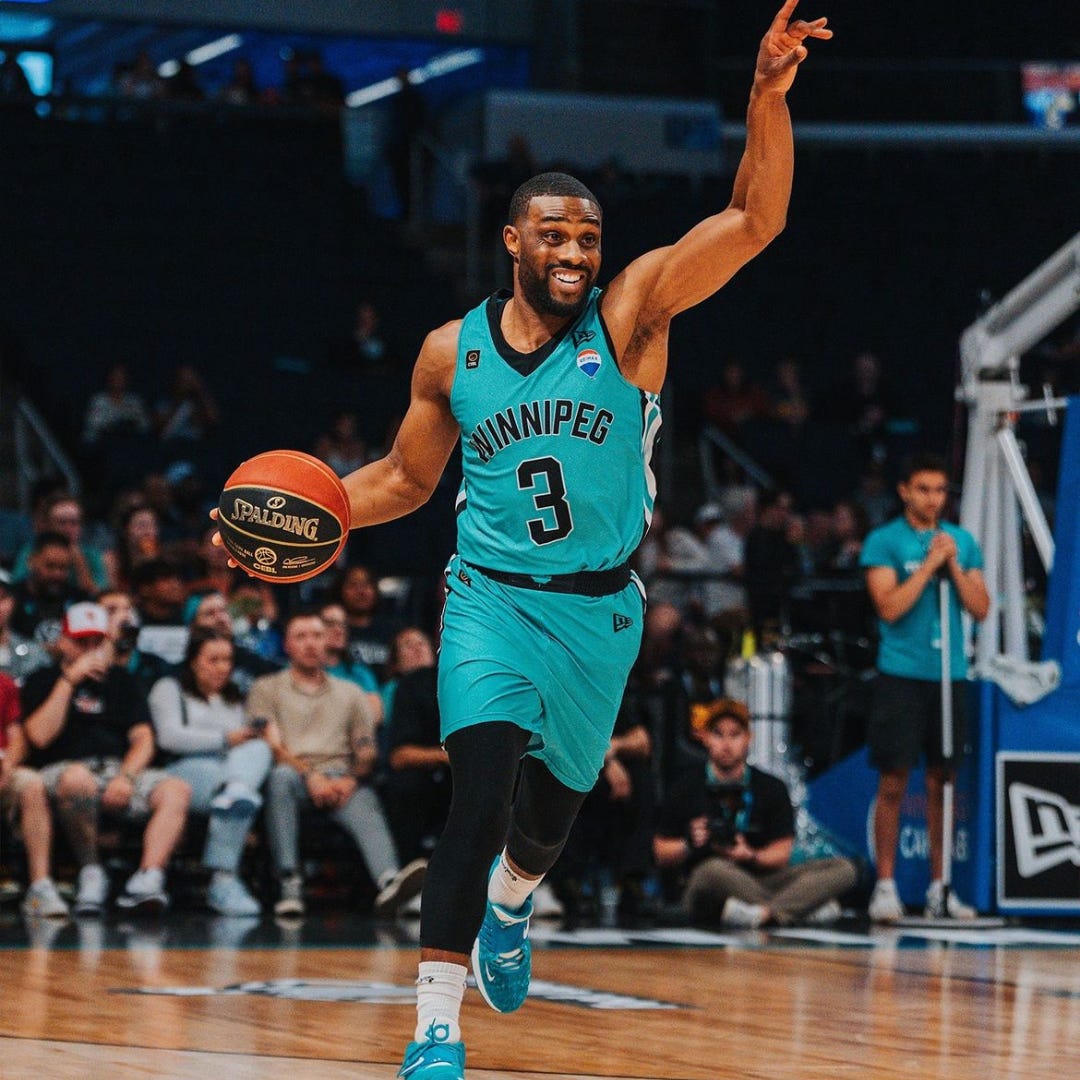
When the Sea Bears teased a teal jersey, I got really excited. And then they gave us this. Basically a teal version of the River Lions jerseys. An alternate jersey should be much more creative than this. I think the teal looks decent but there’s nothing special about this. To make matters worse, the Sea Bears didn’t have them available for purchase for fans when they debuted them back in June.
26. Brampton Honey Badgers “We Are Brampton”

Speaking of jerseys not available for purchase. These Brampton Honey Badgers jerseys are nowhere to be found on their online store. Maybe they are available at their venue but I don’t know.
The stripes that start at the bottom of the shorts and fade into the jersey are a neat look but I’m not sure exactly what the rainbow colours actually represent. There’s nothing on the Honey Badgers channels to suggest any connection to Pride so I’ll have to rule that out.
The chest reads “We Are Brampton” which represents a connection to the city which includes sponsorship by the municipality itself. Interesting concept but the execution could be better.
25. Brampton Honey Badgers Black

We’ve entered the territory of uniforms that I quite like but I have to decide which are better than others. The Honey Badger mascot is just a great one. I love the yellow claw strike on the shorts.
The vertical thin white stripes are a little hard to look at but they still look decent. And yes, they are thin white stripes, not pinstripes. At least in this case.
24. Calgary Surge “Red-Tailed Hawk”
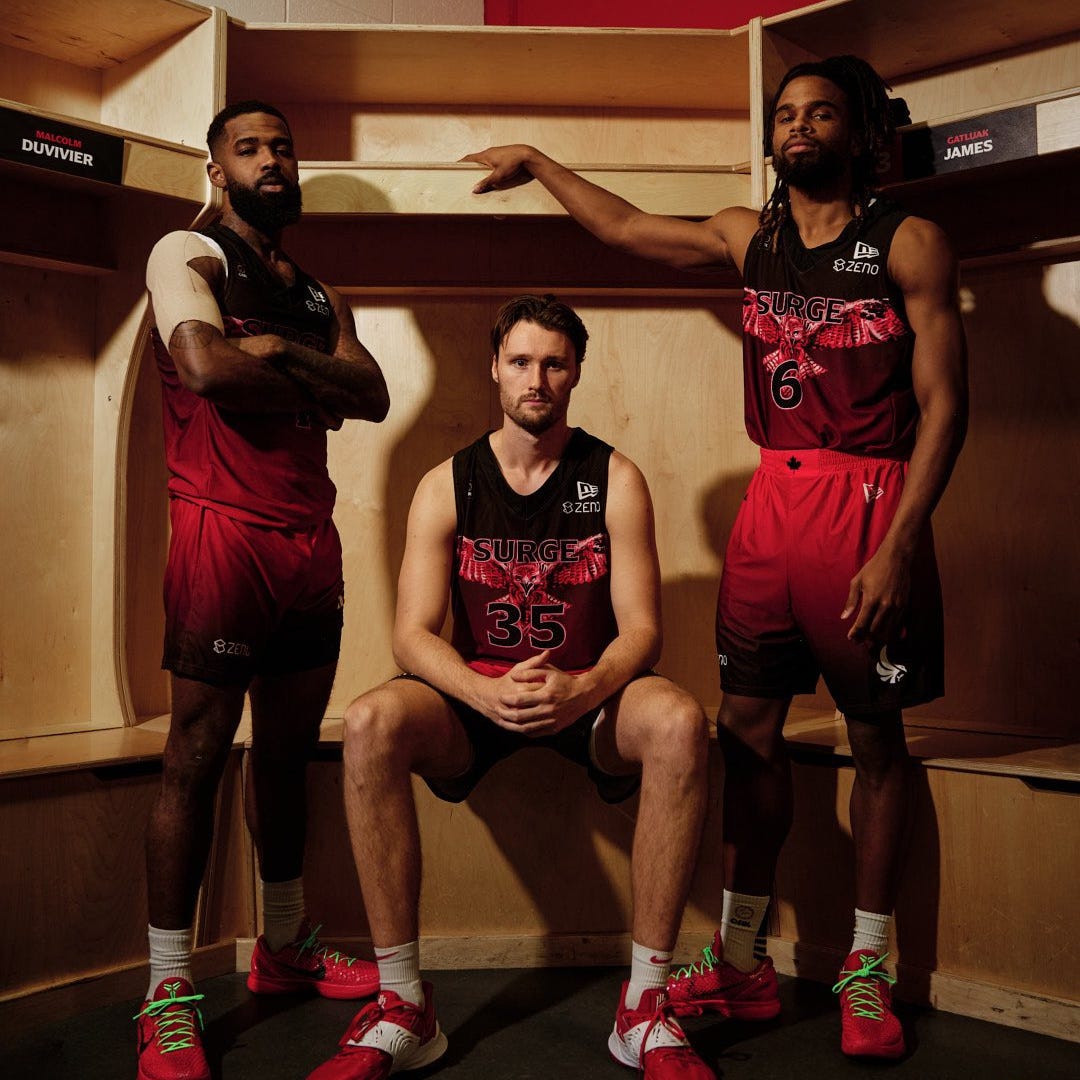
See everyone, I’m not biased!
For the record, I think this is an awesome jersey. But I am a Surge fan and former employee of the organization so I realize there might be some inherent bias in that opinion.
Gradient jerseys are often polarizing but I think Calgary pulls it off well here. I do like the angry hawk with its wings spread but the jersey does get a little busy with the amount of detail as well as the ‘Surge” wordmark on top of the bird. It’s also one of those jerseys that doesn’t look as great on the court as it does in a photoshoot. It’s crazy but I like it.
Stay tuned for parts two and three of my ranking of every current CEBL jersey and please subscribe to the SurgeStack! You can subscribe for free, but if you feel inclined to contribute a few bucks, I would really appreciate it! Any contributions allows me to put more work into this blog.
This is a cool article! I love the fashion angle to sports…if you look great, you play great!
Any jersey with the name “template white” should head to last place.